Onboard: one app to plan and book bus, metro and train trips across city
Role
UX Designer
Duration
1 Month
Team
5 Members
Skill
Usability Testing
User Research
UI Design
Project overview
Imagine the daily commute in India's bustling cities. Not a smooth, predictable journey, but a battle against chaos. You want to do the right thing ditch your car, use public transport. But then the frustration hits: inconsistent schedules, limited real-time data, and non-intuitive tools. This leads to frustration, more private vehicle use, emissions, and congestion. Onboard offers an interactive map for public transport, with detailed routes, stops, and transit options, simplifying multi-leg journeys.
Existing research says the data exists but nobody can use it
Before talking to commuters, I looked at what was already known:
- Distrust feeds itself. Delays, fragmented tools and no real-time updates push people to private vehicles, which adds congestion and emissions.
- Design can change behavior. Tencent Maps (China) suggests eco-friendly routes with CO₂ feedback, and young users started choosing greener options.
- Multi-leg trips are the weak point. Real-time coordination and predictive scheduling can smooth transfers, but only if riders can see and use them.
- Transit systems can now predict and reroute. That's only useful if the interface makes it feel simple.
Indian transport research has six gaps: little UX focus, no multi-mode support, little attention to user emotions, global ideas that don't fit local conditions, real-time data that isn't delivered well, and users left out of the design process.
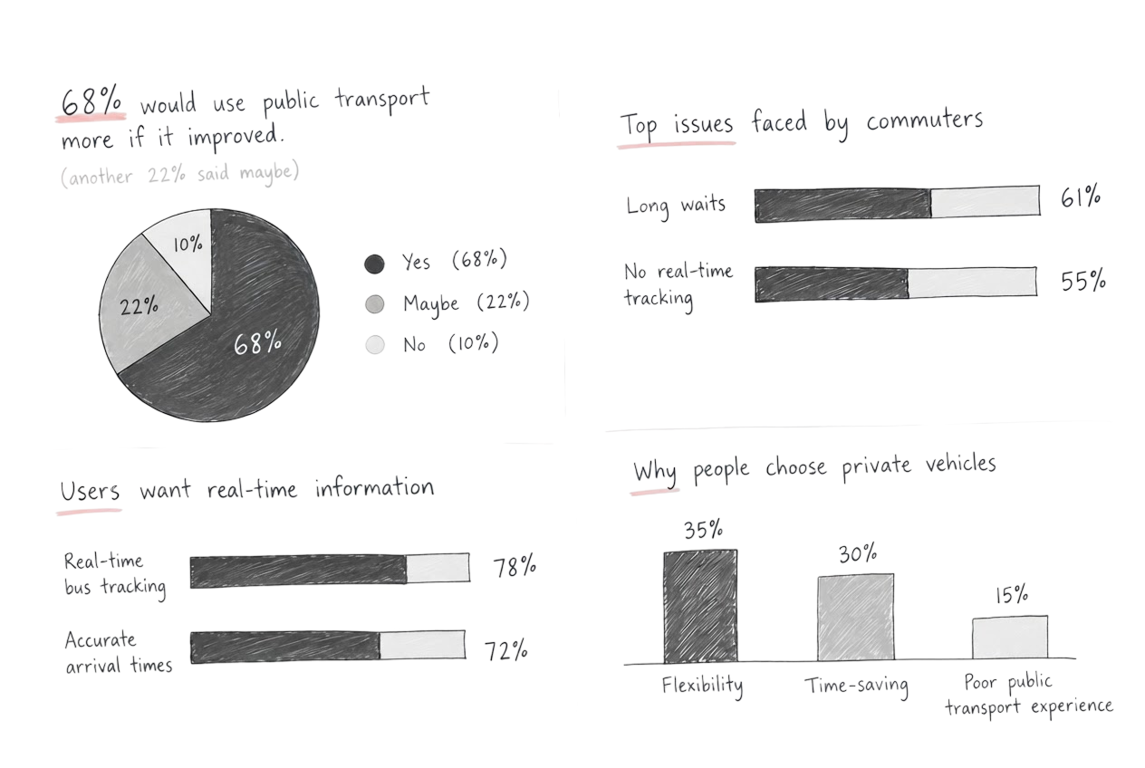
Commuters don't dislike public transport, they can't trust it
After surveying over 100 participants and interviewing more than 60 commuters, here's what I found:
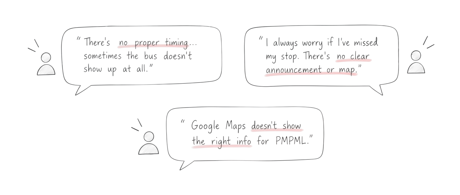
One map-first app that shows the whole multi-mode trip
How might we give commuters an interactive map with detailed routes, stops and options across modes, so planning and following a trip feels clear from start to finish?
First version: from search to ticket in six screens
Home
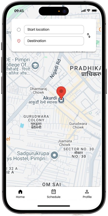
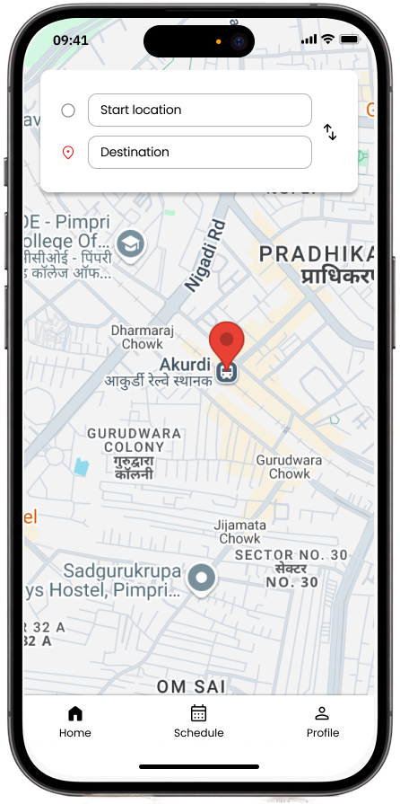
a map with a From/To search on top, so the first action is always "where to?"
Select route
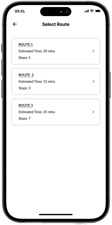
lists route options with estimated time and number of stops, so users can compare before picking one.
Journey details
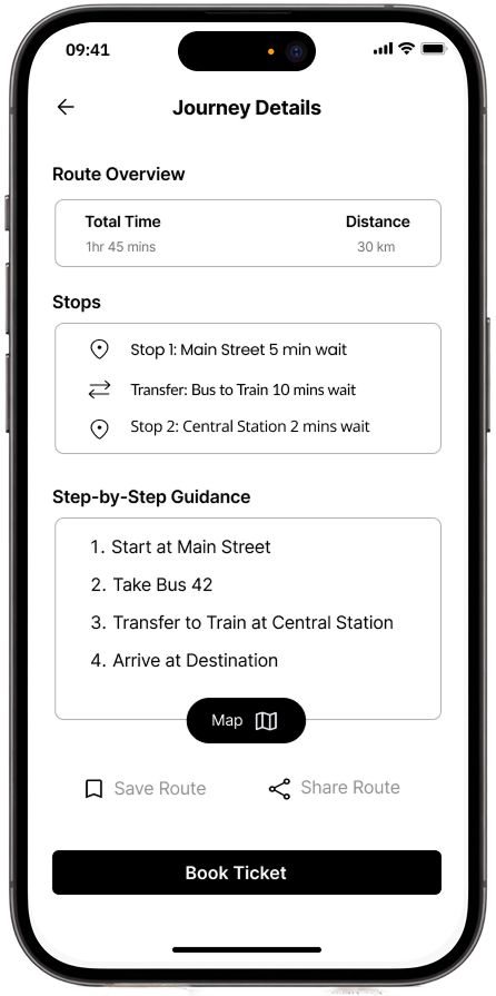
lays out total time, distance and step-by-step guidance for the trip, with a Book Ticket button.
Select mode
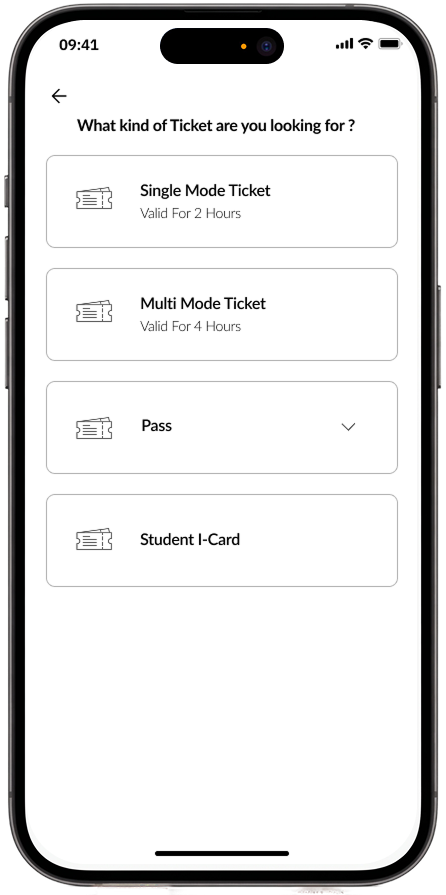
lets users pick a ticket type Single Mode, Multi Mode, Pass or Student I-Card.
Ticket summery
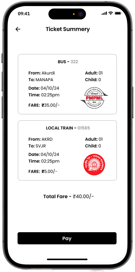
shows fare and journey details for each leg of the trip in one summary before payment.
Payment successful
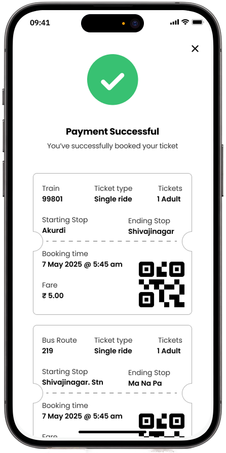
confirms the booking with route, timing and a QR code for each ticket.
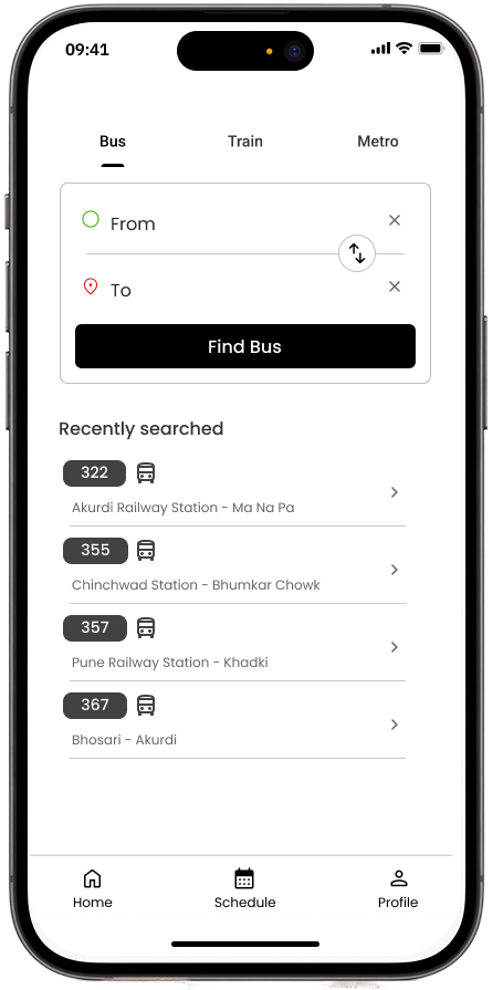
Schedule for bus
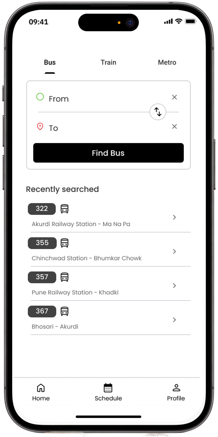
searches bus routes by From/To, with recently searched routes saved for quick rebooking.
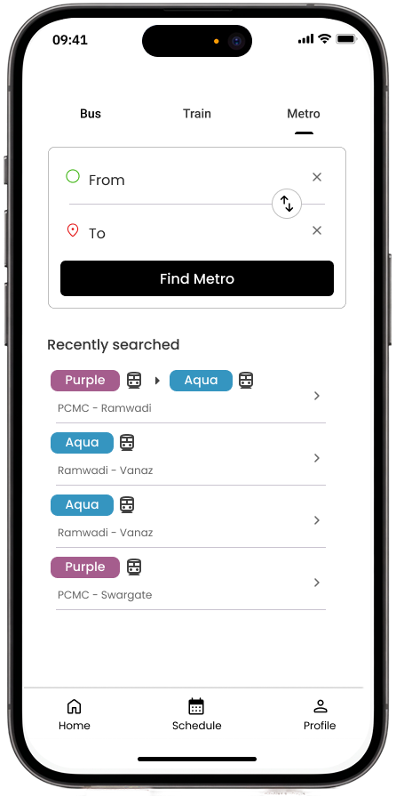
Schedule for metro
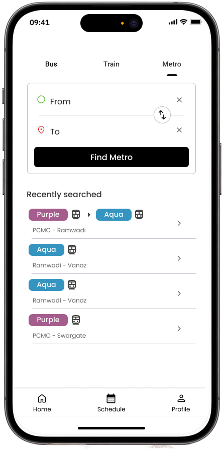
the same search, scoped to metro routes and stations.
Profile
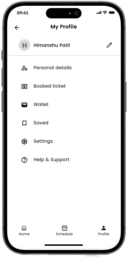
account details with quick links to personal details, booked tickets, wallet, saved routes and settings.
Testing broke three things
I tested the prototype with 10 participants on four tasks (check schedules, book tickets, access real-time updates, view route overviews).
- Route selection: 7 of 10 couldn't tell routes apart, because the screen didn't show start, destination or mode.
- Journey guidance: nothing explained how to switch modes mid-trip, so people didn't trust the transfers.
- Ticket type: participants didn't understand "Single Mode" vs "Multi Mode" and picked one at random.
The call I made
Two findings from testing needed more than a quick label fix.
1. "Single Mode" and "Multi Mode" weren't ticket types users thought in. Keeping them as two separate options meant people had to guess which one matched their trip before they even knew what either term meant. Instead of relabeling the two options, I removed the choice entirely the new booking screen shows each leg of the trip (bus, train) as its own checkbox with its own passenger count, so the "ticket type" is just whatever legs someone selects.
Before
choose "Single" or "Multi Mode".
After
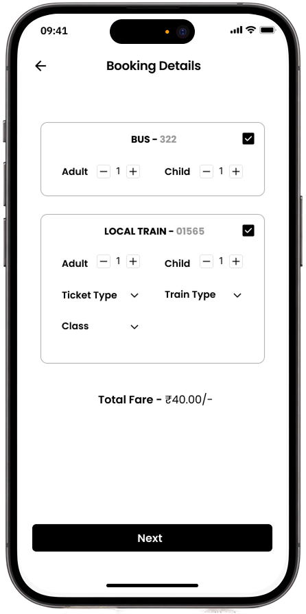
one screen with each leg (bus, local train) as a checkbox and its own passenger count, so users pick what they're taking, not a ticket type they don't recognize.
2. Journey guidance read like a list of instructions instead of what was actually happening. The old step-by-step text told users what to do ("Transfer to train at Central Station") but not where they currently were in the trip, so people didn't trust it when it was time to switch modes. I replaced the text list with a vertical timeline that shows the current leg, the next stop, and the wait or transfer time at each point so the guidance shows status, not just instructions.
Before
a text-heavy list of steps.
After
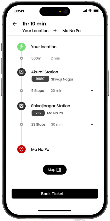
a vertical timeline with each station, stops and time per leg. It's scannable and lowers the reading effort.
3. Route selection just needed the missing labels added back. Showing start, destination and mode directly on each route card fixed this one no restructuring needed, just information that should have been there from the start.
Before
"Route 1, 2, 3" with time and stops.
After
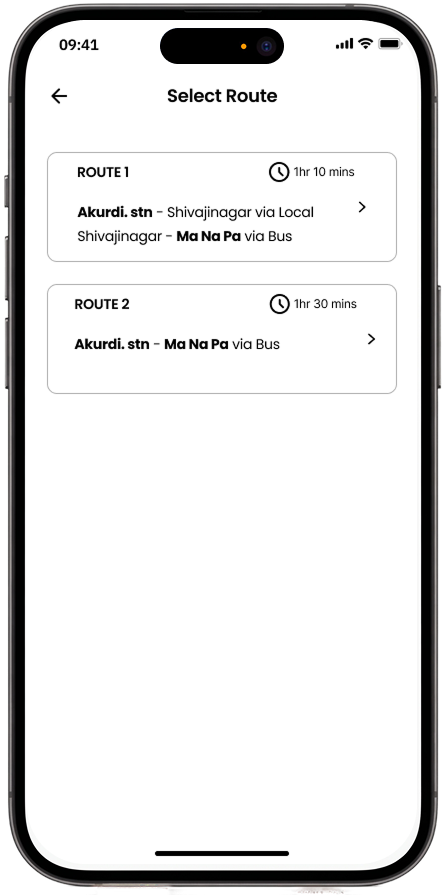
each route shows its full path and total time, so users compare without opening each one
The Result
Three confusion points found in testing route selection, journey guidance, ticket type now map to three specific design changes, each traced back to what a participant actually said or did, not a general facelift.