Cutting MSRTC's bus-ticket booking time from 8 minutes to 2
Role
UX Designer
Duration
1 Week
Team
5 Members
Skill
Usability Testing
Heuristic Evaluation
UI Design
Redesigned MSRTC's booking flow around real usability test findings, cutting average ticket-booking time from 7-8 minutes to about 2.
Project overview
MSRTC's booking website worked, but it made people fight it. I redesigned the flow around what usability testing showed was actually causing the friction confusing labels, a misleading navigation item, and a login step in the wrong place and cut average booking time from 7-8 minutes to about 2.
The problem
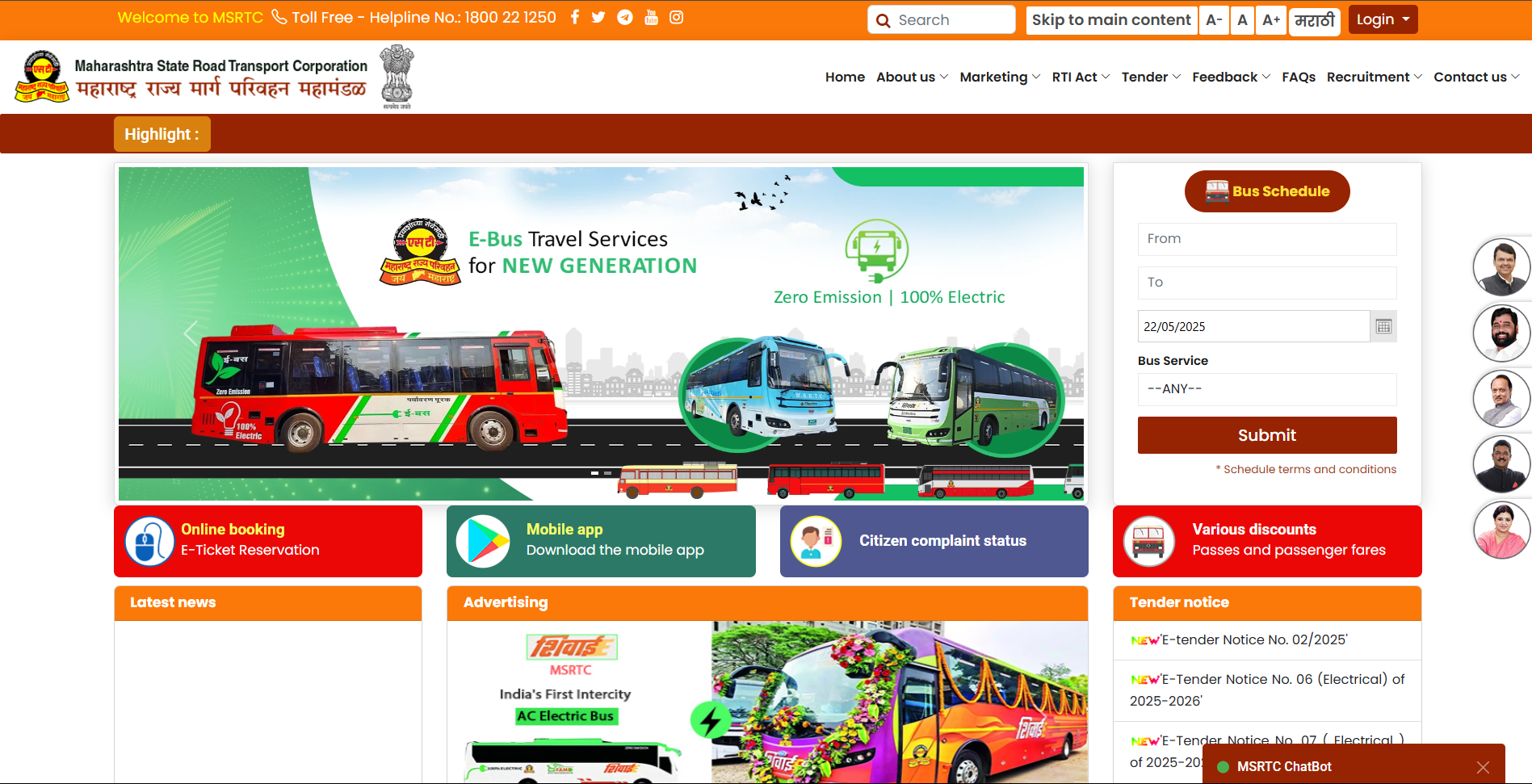
Booking a single bus ticket on the old MSRTC website took users 7-8 minutes. The interface was cluttered, navigation was inconsistent from page to page, and the booking flow had steps that didn't need to exist. Users got lost, backtracked, or gave up.
What I assumed vs. what I found
Before touching any screens, I assumed the site had too much clutter, a disjointed booking process, and that users struggled to find core functions. To check that against real behavior rather than guesswork, I ran usability testing with 30 participants daily commuters and occasional travelers who had used or intended to use online bus booking.
What broke, specifically
- 7 8 minutes average time-on-task to complete one booking, often with backtracking or help from someone else.
- Homepage and subsequent pages were visually overwhelming, with no clear hierarchy between competing calls to action.
- Navigation had no logical grouping users had to search excessively to find schedules, fares, and booking options.
- Button styles, link placement, and terminology changed inconsistently across pages, which read as untrustworthy rather than just unpolished.
- Recognition failures: the site frequently forced users to recall bus numbers or station codes rather than recognize them from a list, with vague error messages and no autofill.
The decision that mattered
Two problems in the old flow weren't obvious until I watched people use it.
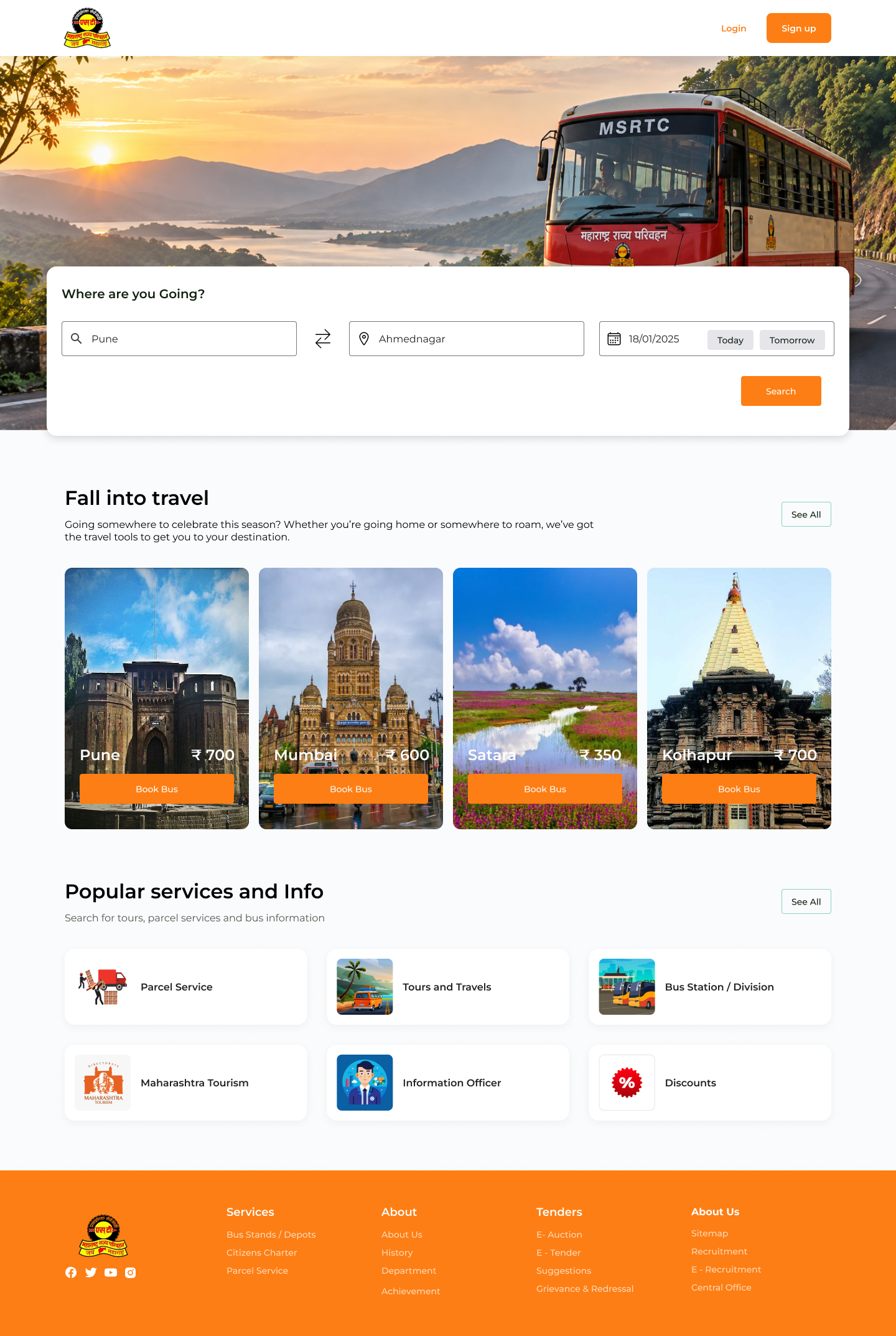
1. The "Schedule" section was pulling people away from booking. It looked enough like a booking flow that users went there first, then had to find their way back to the actual booking section. That extra detour was adding to the 7-8 minute completion time before anyone had even started booking. I replaced the separate "Bus Schedule" widget entirely and consolidated both workflows into a single upfront search bar ("Where are you going?") searching for a destination directly surfaces the available schedule, allowing users to view timings and book their ticket in one continuous flow rather than navigating two separate tools.
2. Login was appearing right before payment, after the whole flow was already filled in. Users completed route, seat, and passenger details, then hit a login wall right before paying and if they weren't already logged in, they lost their progress and had to redo the booking. This was one of the more frustrating points in testing, since people had already invested several minutes by then. I introduced a seamless guest checkout option and preserved form session data throughout, so users can complete their details uninterrupted and sign in or register at payment without losing their entered information
What Changed
Part 1: Before and after
Before: a cluttered page with competing promotions and no clear starting point.
After: one search action up front, with the most-searched destinations (Pune, Mumbai, Satara, Kolhapur) as one-tap shortcuts.
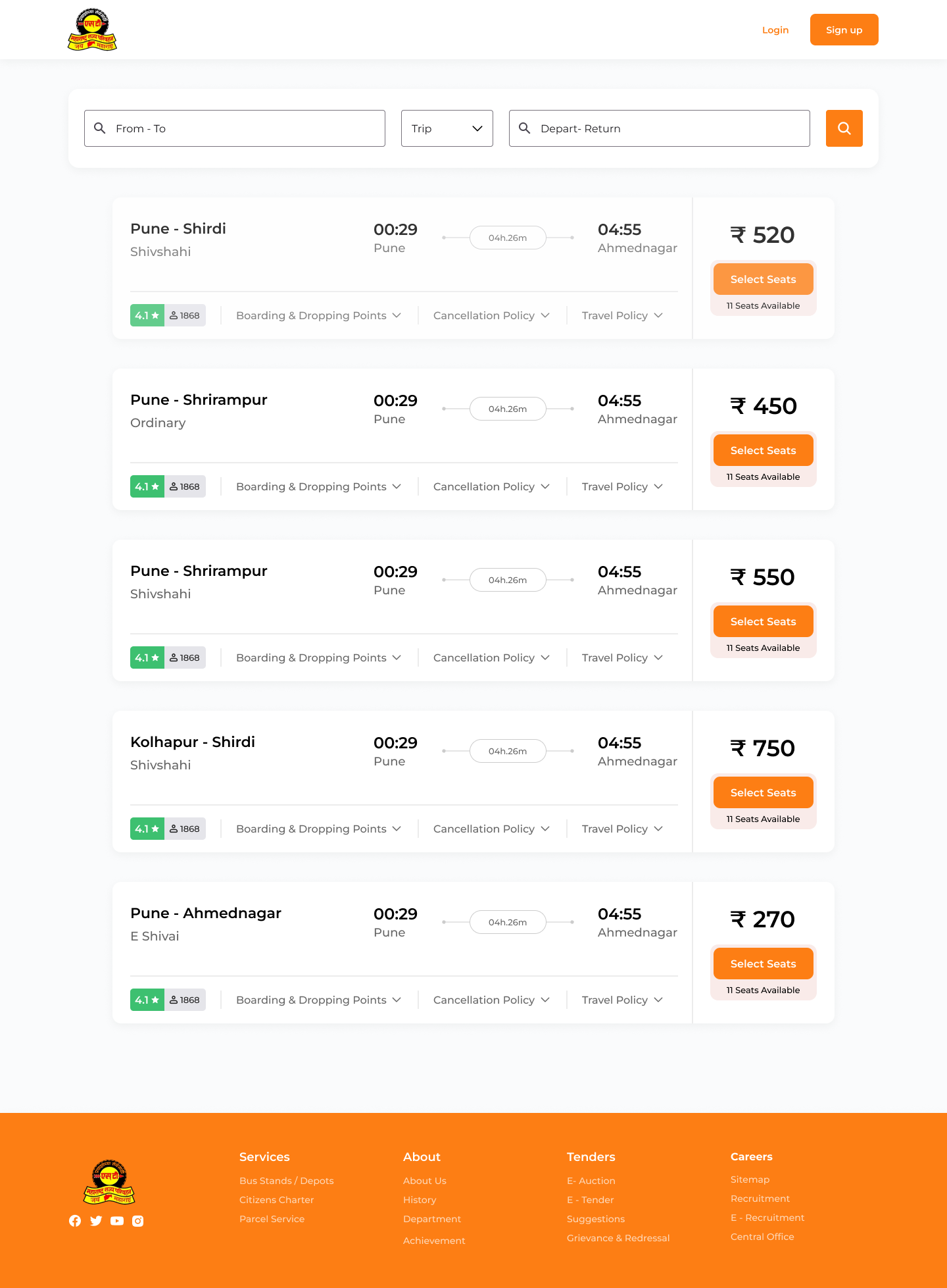
Before: six repeated text labels per row, price and bus type floating apart from the rest of the details.
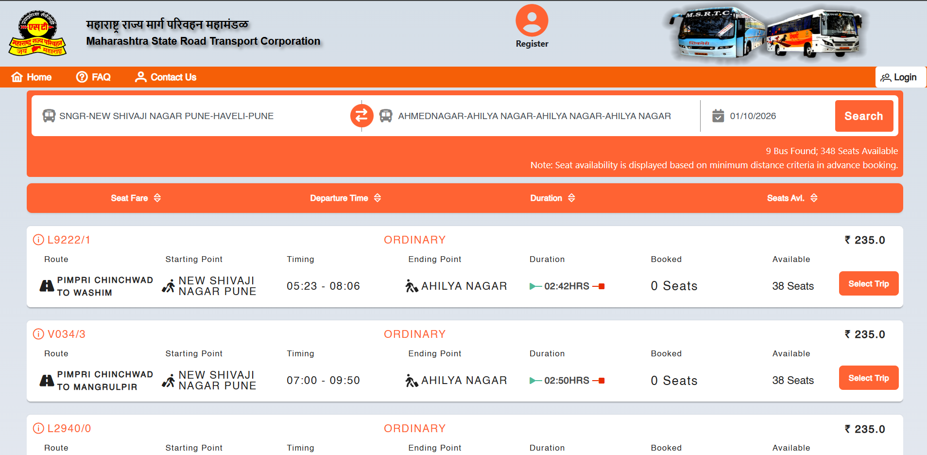
After: every route card uses the same layout, with price, duration and bus type always in the same place, so users stop re-scanning each row.
Part 2: The booking Journey
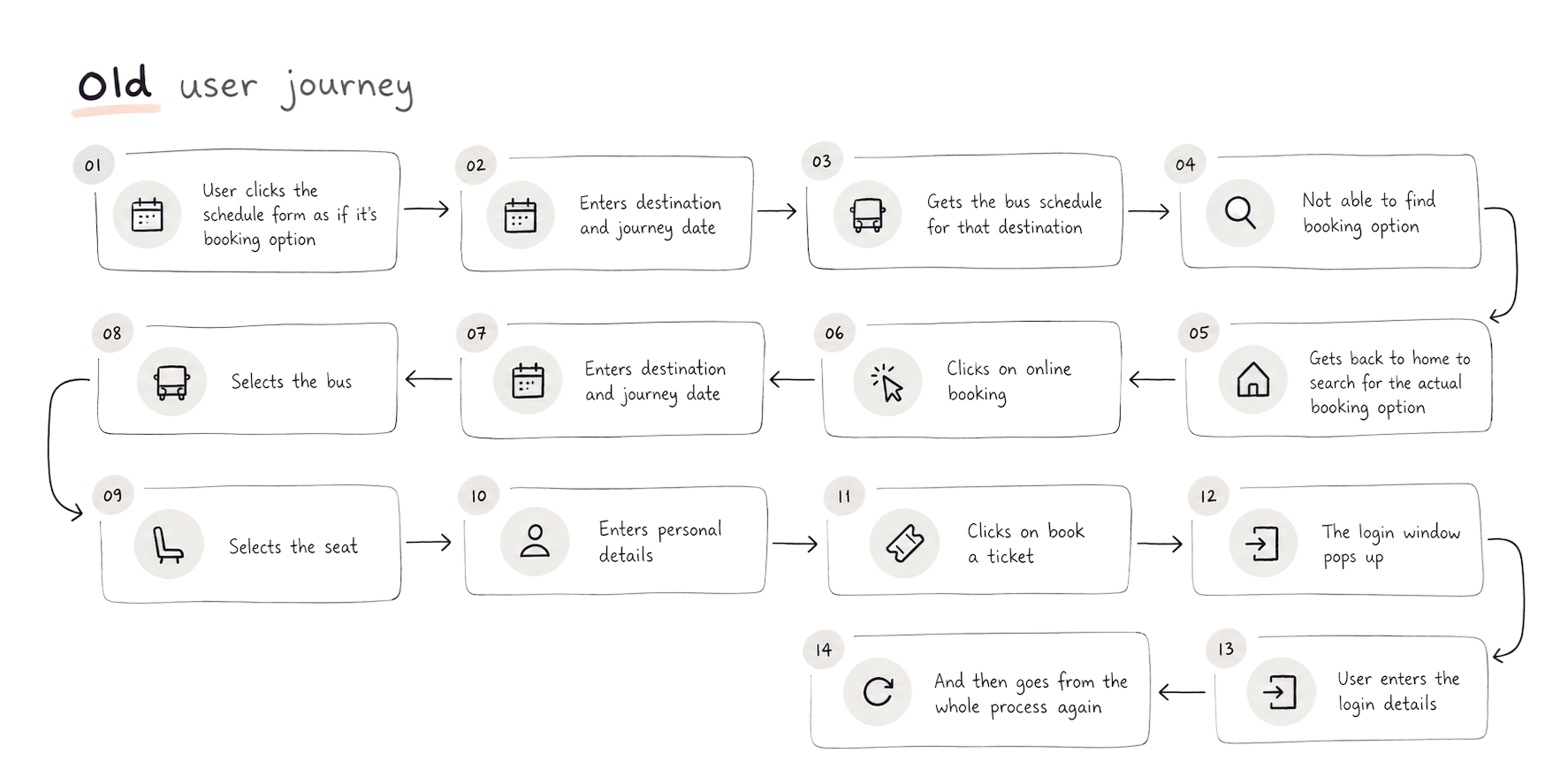
Old user journey
New user journey
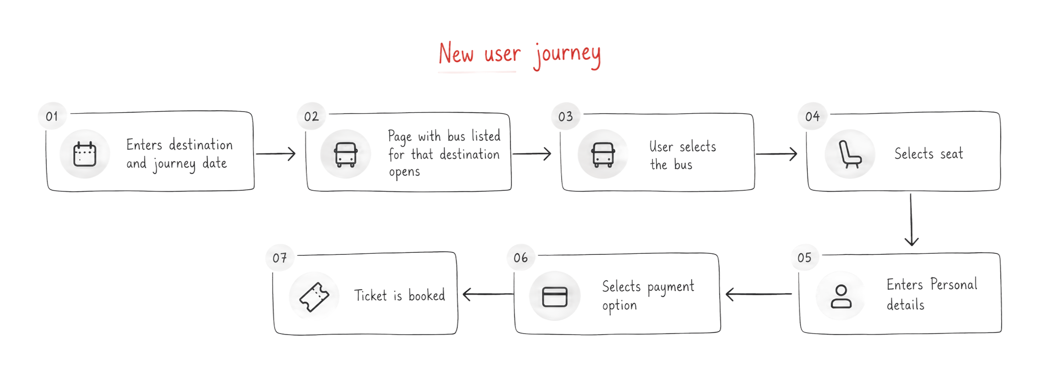
The rest of the booking flow
Seat selection
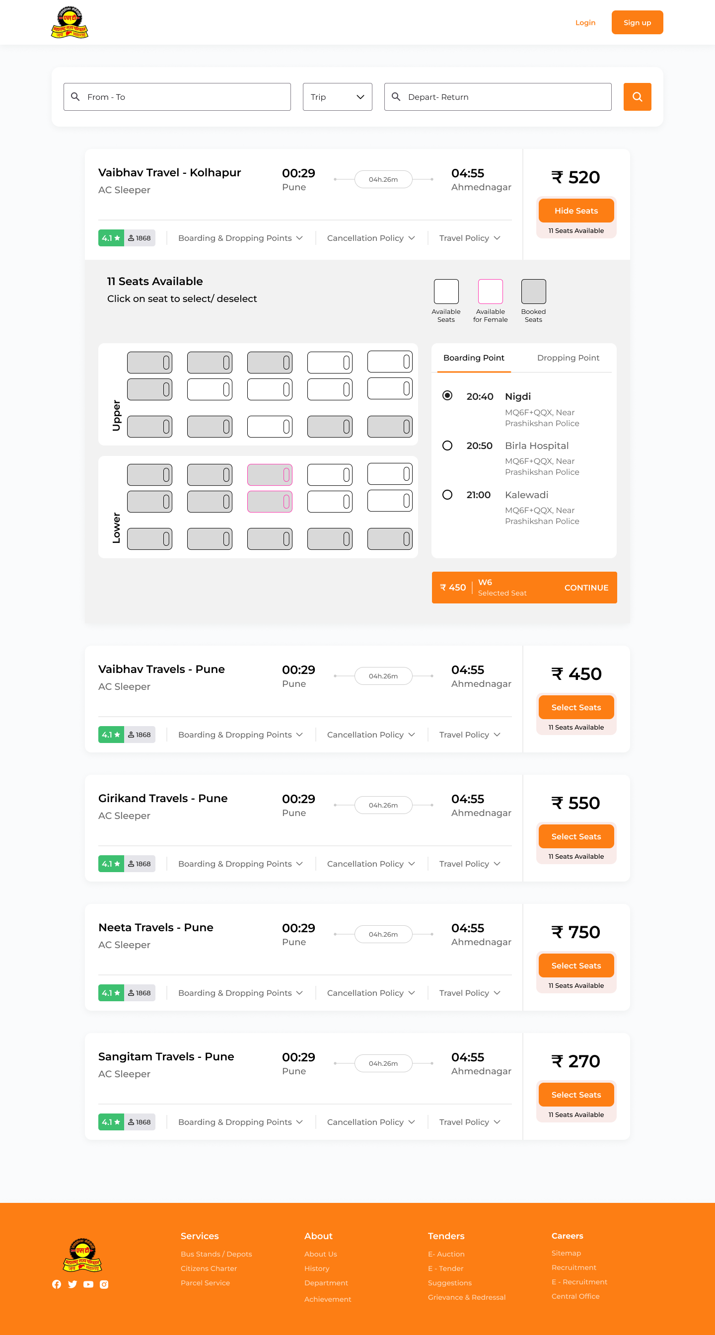
Old flow showed the seat map and the passenger details form in the same panel at the same time, with the seat legend repeated twice and the rest of the listing page still visible above it. New: a dedicated seat-selection screen, separate from passenger details.
Personal details
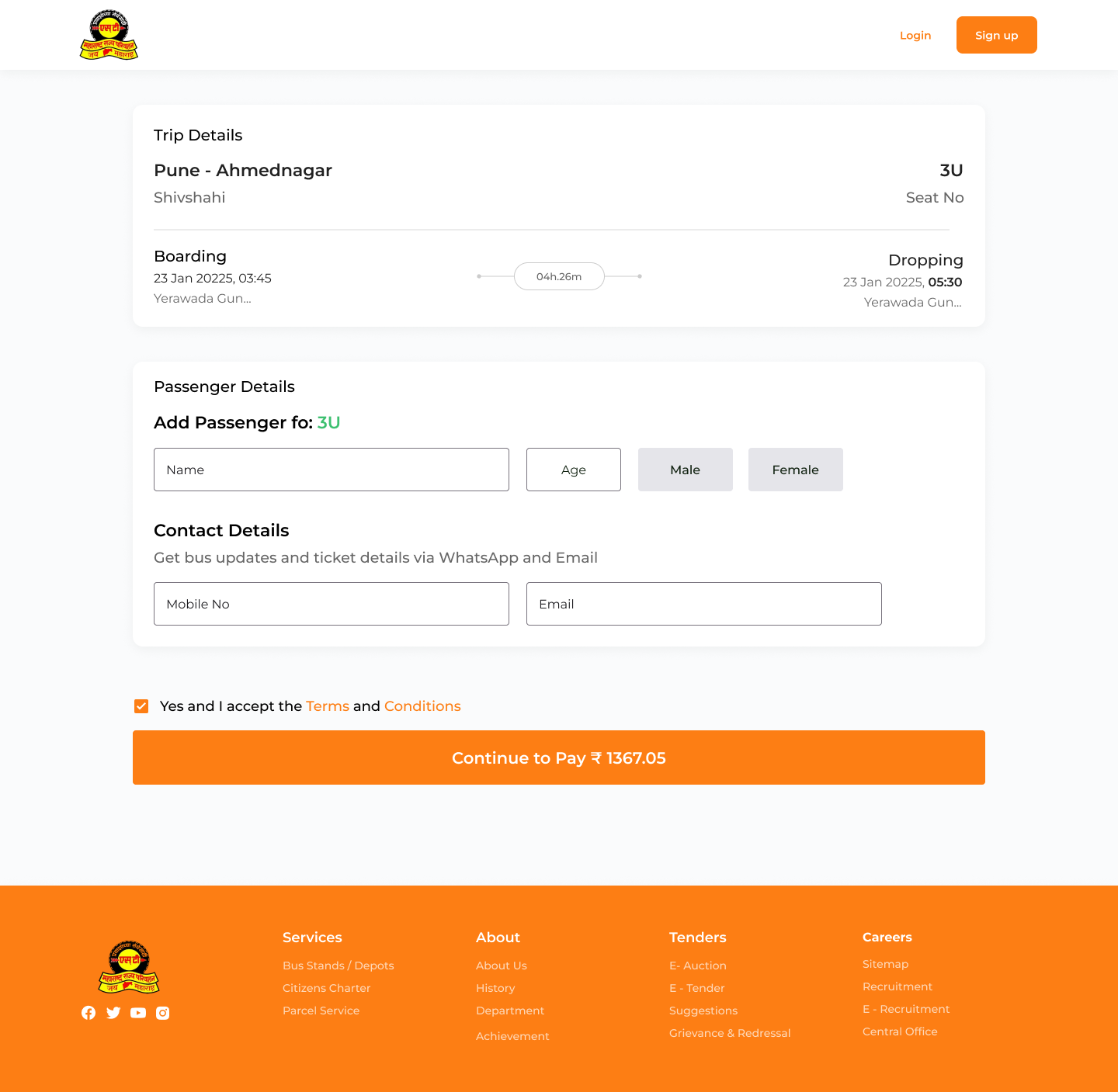
Old flow had contact, email and mobile fields appear directly below the seat map, competing with it for attention in one long panel. New: its own dedicated screen, after seat selection, with nothing else on it.
Payments
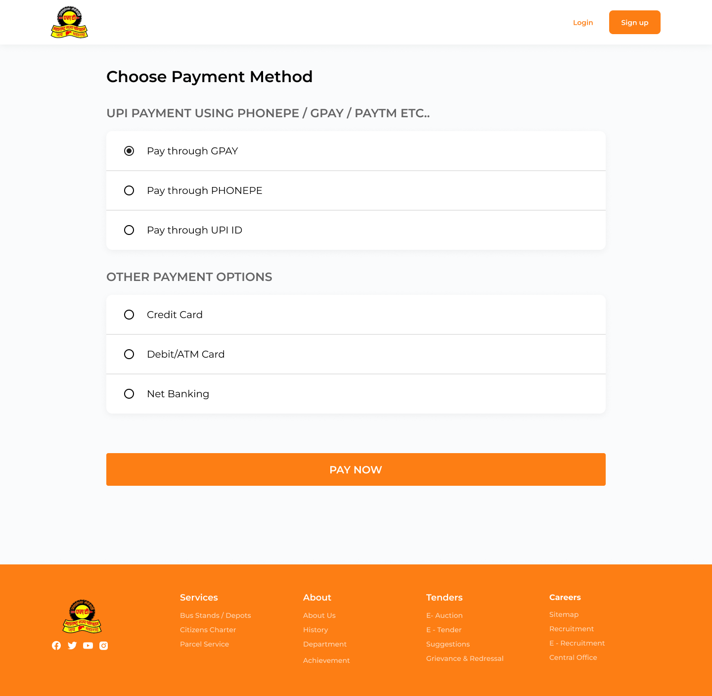
UPI (PhonePe, Google Pay) listed alongside card and net banking, not buried behind an extra step.
Confirmation
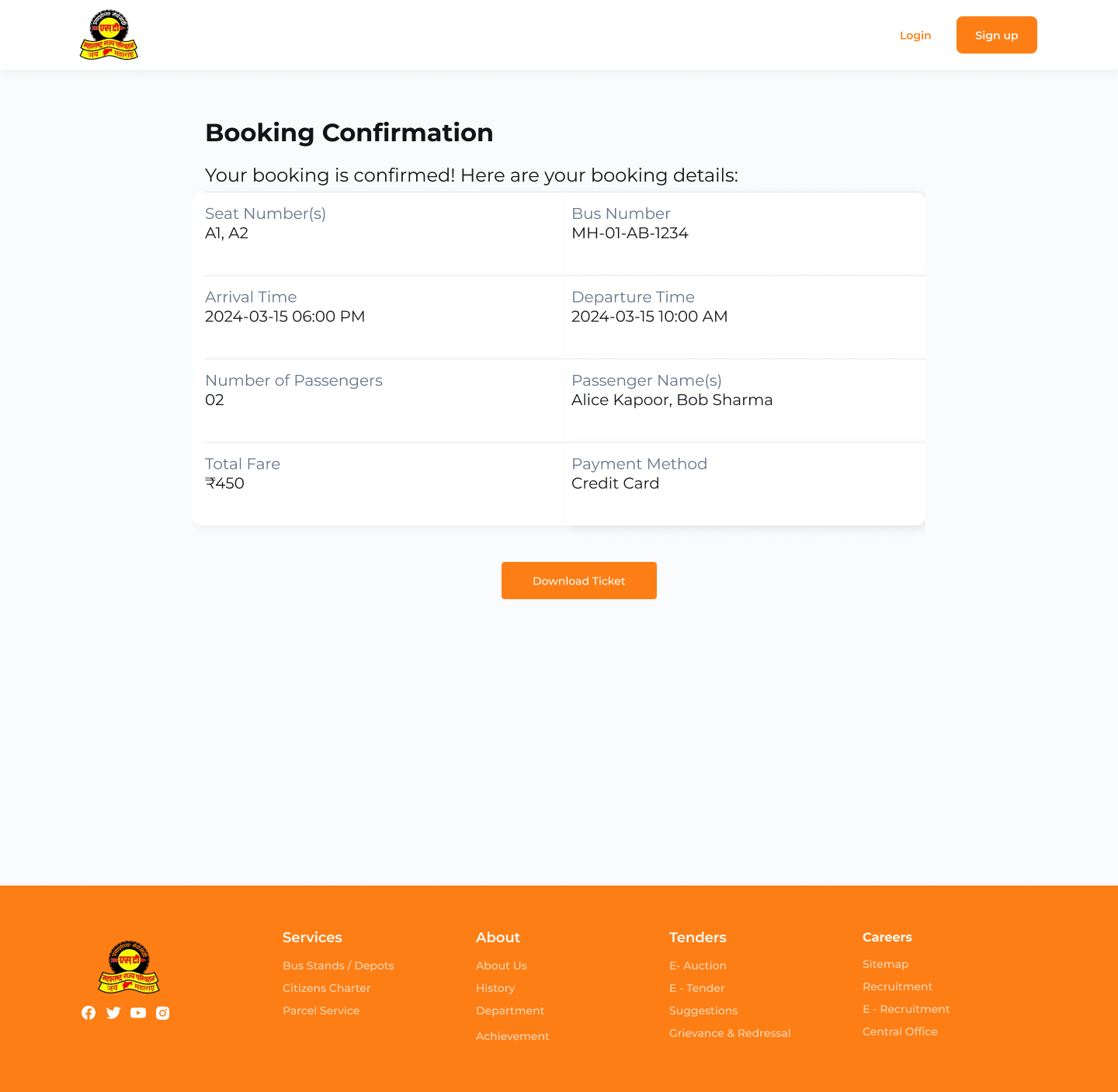
seat, bus, timing, fare and payment method all on one screen, with a download option.
The Result
After the redesign, I ran a second round of usability testing on the new flow. Average time-on-task rate dropped from 7-8 minutes to about 2 minutes.